THE PIONEERS

MARIO TUDOR

[vc_row][vc_column][vc_row_inner][vc_column_inner width=”1/4″][vc_single_image image=”85701″ img_size=”full” alignment=”center” onclick=”custom_link” link=”https://www.artemorbida.com/prodotto/fiber-art-italiana-i-pionieri/?lang=en”][/vc_column_inner][vc_column_inner width=”3/4″][vc_column_text]

This column will present twice a month a historical figure of Italian Fiber Art, present in the book Fiber Art Italiana. I Pionieri.

You can buy it HERE[/vc_column_text][/vc_column_inner][/vc_row_inner][/vc_column][vc_column][vc_column_text]Mario Tudor was born in Gorizia in 1932, moved first to Venice, where he studied at the art high school and the first two years of the Faculty of Architecture, then to Trieste and in 1959 to Milan, where he was employed as an advertising graphic designer working for major brands.

In 1966 he left his job to devote himself exclusively to artistic activity, immediately reported by The New York Times and Herald Tribune International. In the mid-1970s by chance, replacing paper in an outdoor work that the rain had destroyed, he came across fabric, which from then on became the privileged support of his work.[/vc_column_text][vc_single_image image=”100218″ img_size=”full” add_caption=”yes” alignment=”center” onclick=”link_image”][vc_column_text]Mario Tudor’s artistic training took place in Venice, where he began oil painting with an abstract style of painting with precious chromatics. In 1974 he created a fragile outdoor installation for the gardens of the Palazzo Querini-Stampalia in Venice, The Kite on the Lawn, made with egrets, colored tissue paper and bamboo sticks that the rain destroys. The following year he replaces such perishable material with strips of cotton, sewn together and painted in vivid, transparent colors, with which he builds an outdoor path in Path No. 1: His journey in Fiber Art begins here.

The possibilities offered by fabric – its nonperishability, the irregular fringing of its edges, the grain of its surface, the possibilities of assemblage and overlapping – elect it as the material of choice. Tudor then learns to sew and to dye and paint fabric, to control each stage of creation and to exploit its full potential, whether intended or accidental. He invents a personal technique for manually coloring the fabric with broad, successive glazes of fabric dyes, achieving the depth typical of watercolor; he weaves the strips of canvas with a fretwork effect and punctuates them with black graphic interventions in the joint spaces, creating points of vital aggregation, of animated pulsation, which the artist calls: “the inhabitants of my works.”[/vc_column_text][vc_single_image image=”100224″ img_size=”full” add_caption=”yes” alignment=”center” onclick=”link_image”][vc_column_text]Between 1975 and 1979 he worked on the series of Wind Sculptures and Floating Sculptures, arranged above water in the canals of the lagoon, such as Ancha. At the same time he continued to create two-dimensional works with simple but unusual geometric forms, primary but singular.

This gave rise to the series named after the stars given to them by ancient Arab astronomers: Ksora and Kerb (both 1980), Kaape and Kai (both 1987), works with a scalar shape like astronomical maps, whose black background is studded with small pockets that when open show clear and bright shapes like animated galaxies; when closed, on the other hand, they “turn off” the sky, as in Borges’ story in which, after the prayerer has named all the names of God, the stars disappear and the world ends.

Other works that can be opened and closed include the Secret Notebooks series, which enclose mysterious colorful, throbbing objects in their inner pockets (such as calicantus seeds, the silhouette of a firefly, a small rubber lobster), and the Witches’ Pouches series, in the form of canvas bags strewn with pockets animated by tiny secrets.

Interested in bringing his works to life, he often makes it possible for the viewer’s intervention to modify the work, now by means of loops that allow the piece to be disassembled and reassembled at will, now by shifting the tension of the thread from which it hangs, obtaining ever-changing paths, now by opening and closing certain parts. The mysterious ideograms take on thickness and gain independence as primary biological units that live above and outside the fabric: first they are painted in black, then cut out in a brass plate, then in felt dyed and hardened by resins.[/vc_column_text][vc_single_image image=”100215″ img_size=”full” add_caption=”yes” alignment=”center” onclick=”link_image”][vc_column_text]In 1992 he created the series of Doors to the Wind, such as Blue Door and The Night Door, fixed at the top and constructed in the form of a pierced lintel, with the uprights raised and swaying with every shift of air caused by movement of those passing through them.

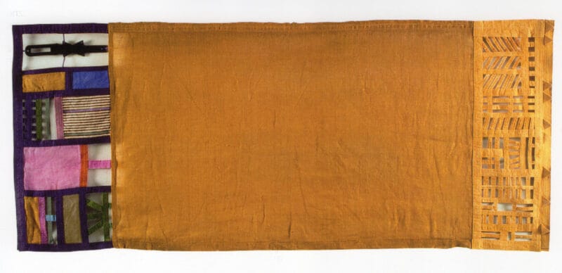
Another recurring theme is that of cloth tapestries structured according to the compositional mode of the oriental carpet, whose symmetry, however, it denies by thickening the patterns at the edges; as in: Campo giallo (1991) in a luminous mimosa yellow, Hortus conclusus (1994) and Campo di grano (2001) in its warm gradations that turn from turmeric yellow to terracotta. In Quarto nero (1996) two margins are fretwork effect crossed by light. While in The Day and the Night (2011) Tudor deploys sunny, daytime vitality on one margin and dark, nocturnal vitality on the other, around the central blue-violet. Untitled (2018) accentuates the lightness of the work. In its three-dimensional dimension that creates an enclosed space within which its ideograms are arranged behind and in front of the light cerulean lattice, animating it.

The Tower of Saved Signs (2012) is an editable work in which shifting panels reveal precious secrets and create ever new versions.

In his works, a taste for sensual and languid colors, lace-perforated surfaces, and Byzantine preciousness that he draws from his long residence in Venice, which Tudor tempers with the discretion and reserve that Milan imposes on its inhabitants, originate the unmistakable style, both sumptuous and measured, that characterizes his production.[/vc_column_text][vc_single_image image=”100221″ img_size=”full” add_caption=”yes” alignment=”center” onclick=”link_image”][/vc_column][/vc_row]

I PIONIERI

MARIO TUDOR

[vc_row][vc_column][vc_row_inner][vc_column_inner width=”1/4″][vc_single_image image=”85700″ img_size=”full” alignment=”center” onclick=”custom_link” link=”https://www.artemorbida.com/prodotto/fiber-art-italiana-i-pionieri/”][/vc_column_inner][vc_column_inner width=”3/4″][vc_column_text]Questa rubrica presenterà due volte al mese una figura storica della Fiber Art Italiana, presente nel libro di Renata Pompas.

Puoi acquistarlo QUI[/vc_column_text][/vc_column_inner][/vc_row_inner][/vc_column][vc_column][vc_column_text]Mario Tudor nasce a Gorizia nel 1932, si trasferisce dapprima a Venezia, dove studia al liceo artistico e al primo biennio della facoltà di Architettura, quindi a Trieste e nel 1959 a Milano, dove si impiega come grafico pubblicitario lavorando per grandi marchi.

Nel 1966 lascia il lavoro per dedicarsi esclusivamente all’attività artistica, subito segnalato dal The New York Times e dall’Herald Tribune International. A metà degli anni Settanta casualmente, sostituendo la carta in un’opera all’aperto che la pioggia aveva distrutto, si imbatte nel tessuto, che da allora diventa il supporto privilegiato del suo operare.[/vc_column_text][vc_single_image image=”100217″ img_size=”full” add_caption=”yes” alignment=”center” onclick=”link_image”][vc_column_text]La formazione artistica di Mario Tudor avviene a Venezia, dove inizia a dipingere ad olio con una pittura astratta dai preziosi cromatismi. Nel 1974 crea una fragile installazione all’aperto per i giardini del Palazzo Querini-Stampalia di Venezia, L’aquilone sul prato, realizzata con garzette, carta velina colorata e stecche di bambù che la pioggia distrugge. L’anno successivo sostituisce il materiale così deperibile con delle strisce di cotone, cucite assieme e dipinte con colori vividi e trasparenti, con cui costruisce un cammino all’aperto in Percorso n. 1: il suo cammino nella Fiber Art inizia da qui.

Le possibilità offerte dal tessuto – la non deperibilità, la frangiatura irregolare dei margini, la grana della superficie, le possibilità di assembramento e di sovrapposizione – lo eleggono a materiale privilegiato. Tudor impara quindi a cucire e a tingere e dipingere la stoffa, per controllare ogni fase della creazione e per sfruttarne tutte le potenzialità, previste o accidentali. Inventa una tecnica personale per colorare manualmente il tessuto con ampie e successive velature di coloranti per stoffe, ottenendo la profondità tipica dell’acquerello; intreccia le strisce di tela con effetto traforo e le punteggia con interventi grafici neri negli spazi di giuntura, creando dei punti di aggregazione vitale, di pulsazione animata, che l’artista chiama: “gli abitanti dei miei lavori”.[/vc_column_text][vc_single_image image=”100223″ img_size=”full” add_caption=”yes” alignment=”center” onclick=”link_image”][vc_column_text]Tra il 1975 e il 1979 lavora alla serie delle Sculture a vento e delle Sculture galleggianti, disposte a pelo d’acqua nei canali della laguna, come Ancha. Contemporaneamente prosegue la creazione di opere bidimensionali dalle forme geometriche semplici ma insolite, primarie ma singolari.

Nasce la serie che prende il nome delle stelle a loro attribuito dagli antichi astronomi arabi: Ksora e Kerb (entrambe del 1980), Kaape e Kai (entrambe del 1987), opere di forma scalare come le mappe astronomiche, il cui fondo nero è costellato da piccole tasche che quando sono aperte mostrano forme chiare e luminose come galassie animate; quando sono chiuse invece “spengono” il cielo, come nel racconto di Borges in cui, dopo che l’orante ha nominato tutti i nomi di Dio, le stelle scompaiono e il mondo finisce.

Tra le opere apribili e chiudibili c’è anche la serie dei Quaderni segreti, che racchiudono misteriosi oggetti colorati e palpitanti nelle tasche interne (come i semi di calicantus, la sagoma di una lucciola, una piccola aragosta di gomma) e la serie delle Sacche delle streghe, a forma di borse di tela disseminate di tasche animate da minuscoli segreti.

Interessato a far vivere i suoi lavori spesso fa in modo che l’intervento dello spettatore possa modificare l’opera, ora mediante delle asole che consentono di smontare e rimontare il pezzo a piacere, ora spostando la tensione del filo a cui è appesa ottenendo percorsi sempre diversi, ora aprendo e chiudendo alcune parti. I misteriosi ideogrammi prendono spessore e acquisiscono indipendenza come unità biologiche primarie che vivono al di sopra e al di fuori del tessuto: dapprima sono dipinti in nero, poi ritagliati in una lastra d’ottone, quindi nel feltro tinto e indurito da resine.[/vc_column_text][vc_single_image image=”100214″ img_size=”full” add_caption=”yes” alignment=”center” onclick=”link_image”][vc_column_text]Nel 1992 crea la serie delle Porte al vento, come Porta azzurra e La porta della notte, fissate nella parte superiore e costruite a forma di architrave traforata, con i montanti sollevati che ondeggiano ad ogni spostamento d’aria provocato da movimento di chi le attraversa.

Un altro tema ricorrente è quello degli arazzi di stoffa strutturati secondo la modalità compositiva del tappeto orientale, di cui però nega la simmetria, addensando i motivi ai margini; come in: Campo giallo (1991) in un luminoso giallo mimosa, Hortus conclusus (1994) e Campo di grano (2001) nelle sue  calde gradazioni che dal giallo curcuma virano al terracotta. Nel Quarto nero (1996) due margini sono a effetto traforo attraversati dalla luce. Mentre ne Il giorno e la notte (2011) Tudor dispiega la vitalità solare e diurna su un margine e quella scura e notturna sull’altro, attorno al blu-violaceo centrale. Senza Titolo (2018) accentua la leggerezza dell’opera. Nella sua dimensione tridimensionale che crea uno spazio racchiuso entro il quale i suoi ideogrammi si dispongono dietro e davanti alla leggera grata cerulea, animandola.

La torre dei segni salvati (2012) è un’opera modificabile in cui lo spostamento dei pannelli rivela segreti preziosi e crea sempre nuove versioni.

Nelle sue opere un gusto per i colori sensuali e languidi, per le superfici traforate a merletto e la preziosità bizantina che attinge dalla sua lunga residenza a Venezia, che Tudor tempra con la discrezione e la riservatezza che Milano impone ai suoi abitanti, originano quello stile inconfondibile, sontuoso e misurato, che caratterizza la sua produzione.[/vc_column_text][vc_single_image image=”100220″ img_size=”full” add_caption=”yes” alignment=”center” onclick=”link_image”][/vc_column][/vc_row]

Renata Pompas

Renata Pompas è giornalista, saggista e docente; i suoi campi di interesse e applicazione sono: il Colore, il Textile Design e la Fiber Art. Ha lavorato come textile designer per la moda e per la casa, è stata direttore del corso Digital Textile Design ad Afol Moda dove ha insegnato progetto e colore. Ha tenuto lezioni e seminari in Università e Accademie in Italia e all'estero, ha organizzato seminari aziendali, corsi privati individuali e collettivi. Ha pubblicato diversi libri, articoli, testi in catalogo, relazioni in Convegni nazionali e internazionali.  www.color-and-colors.it